
Analyze Dashboard
Deprecation NoticeThe content on this page has been deprecated and is no longer valid. We have made significant improvements and updates to provide you with the most accurate and up-to-date information.
To learn more about:
- Next Identity Console, please vist: Next Identity Console
- Analyze Features, please visit: Next Identity Analyze
The Next Identity Analyze dashboard is an administration portal providing insight into key identity analytics including registration drop off rates, performance metrics, current transactions by client, end-to-end delivery metrics for email or SMS.
Dashboard overview
The Analyze dashboard is divided into the sidebar and the main window. Learn more about them in the following sections.
To change the default color scheme of the dashboard for better usability, click on the dark mode button besides the profile button on the upper right corner of the dashboard.
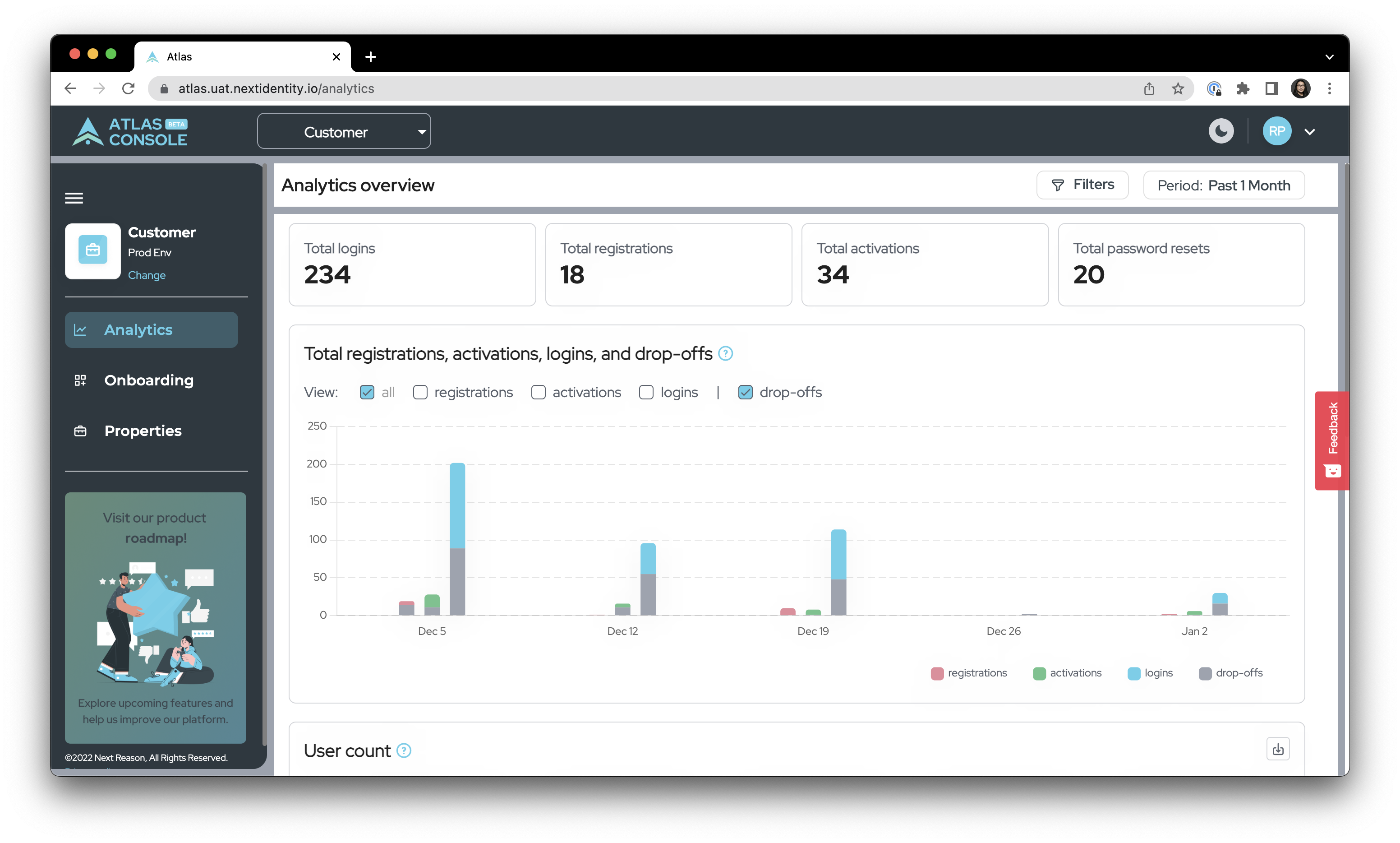
The Next Identity Analyze dashboard.
The Next Identity Analyze dashboard in dark mode.
Organizations and environments menus
The left sidebar displays the current organization and environment whose data is being displayed in the main Analyze window. The sidebar also contains menus to select which organization, environments and properties to display. There's also a link to the product roadmap where you can explore upcoming features and help us improve our platform.
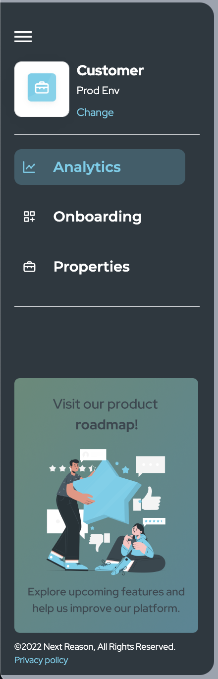
Sidebar menu.
Changing the organization and environments
You can use Analyze to view key data on all organizations and environments of a customer.
To change the organization and environment to display:
- Click on the Change link on the upper left hand menu.
- Click on the Organization dropdown menu and select your preferred organization. The data on the Analyze window will be updated. The options for the Environment dropdown menu will be updated as well.
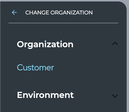
Select the organization to display.
- Click on the Environment dropdown menu and select the environment.
The data on the Analyze overview and other graphs will be updated.
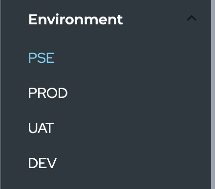
Select the environment to display.
Analyze overview
The Analyze overview section provides a quick look into the total number of logins, registrations, activations and password resets for the whole organization selected on the Organization and Environment menus on the left side bar.

Next Identity Analyze overview
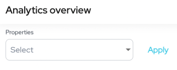
Filters (filter by properties)
Aside from organizations and environments, you can further filter the data displayed by properties.
To display data for a particular property,
- Click on Filters. The Properties dropdown menu appears.
Filter by properties.
-
Select the property to display from the dropdown.
To filter information for multiple properties, select the checkboxes of your preferred properties. -
Click Apply to display data for the selected property only.
Time Period
The Analyze dashboard initially displays data from the last 30 days. You can select other periods of time, such as the past one week, past one month, or any custom range.

Time period selection.
Please note of the time period details below.
For this example, we assume the current day is January 2, 2022:
- Today (Whole day from January 2, 12:00AM - 11:59PM)
- Yesterday (Whole day of previous day from January 1, 12:00AM - 11:59PM)
- Past 1 Week (Covering 8 days a week including today's date)
- Past 1 Month (Covering 30 days including today's date)
To set a custom period of time, click on the start date on the calendar, and then click on the end date. To confirm your selection, click on Apply.
To disregard your selection, click on Cancel.
The information on the dashboard will be updated based on the selected period.
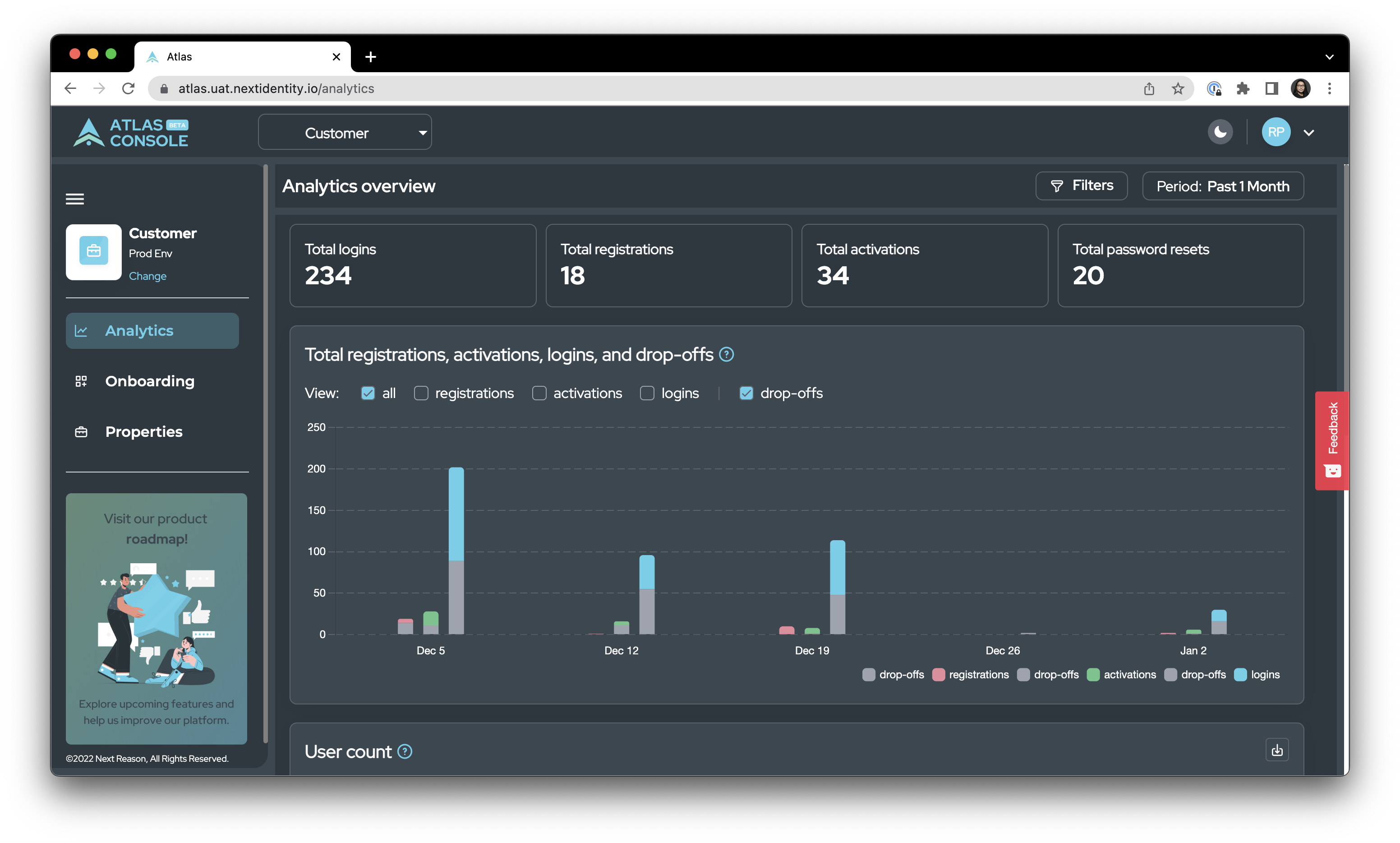
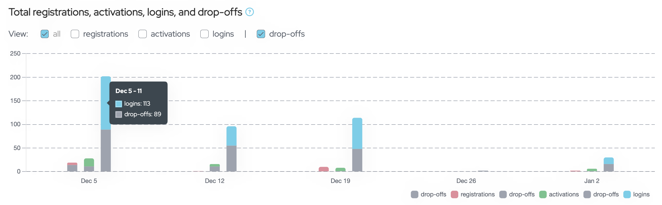
Total registrations, activations, logins, and drop-offs
This graph shows the total number of registrations, activations, logins, and drop-offs during the selected time period. Hover over a bar to show the total counts for the selected section (registrations, activations, logins or drop-offs).
The Total registrations, activations, logins, and drop-offs graph.
The graph shows you the following information:
Registrations: The number of times the register-success page or insert-pin page was rendered.
Activations: The number of users who successfully activate their account.
Logins: The number of users who successfully logged in.
Drop-offs: The number of users who started the process but did not complete it.
To filter the information shown on the graph, select the checkbox that corresponds to the information you want to display. For example, if you prefer to display only registrations and registration drop-offs, select the registrations checkbox.
By default, the drop-offs checkbox is selected. If you prefer not to display drop-offs, deselect the drop-offs checkbox.
User count
The User count graph provides an overview of the users in the properties in the selected customer within the selected time period and properties. If no property is selected, it shows all the users for all properties.
User count values are accumulatedThe user counts displayed in the user count graph are the accumulation of the number of users from the start of user count data collection until the period filtered to be displayed.
For example, if you filter the period of one (1) day, June 9, 2022, the user count graph will show user counts from the date when user count data started to collected up to June 9, 2022.
User counts display the top 10 properties with the highest number of users. Each line represents the number of users of a property over time.
To download the chart's data in CSV format, click on the download button.
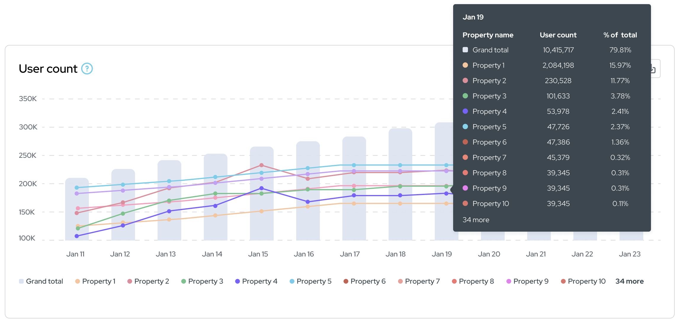
The User count graph.
To hide the information for a specific property presented in the graph, click on its name found at the bottom of the graph.
API usage
This graph shows the total number of times an API endpoint was called during the selected time period.
Click or hover any of the API endpoint columns to display a more precise value for that API endpoint's usage count.
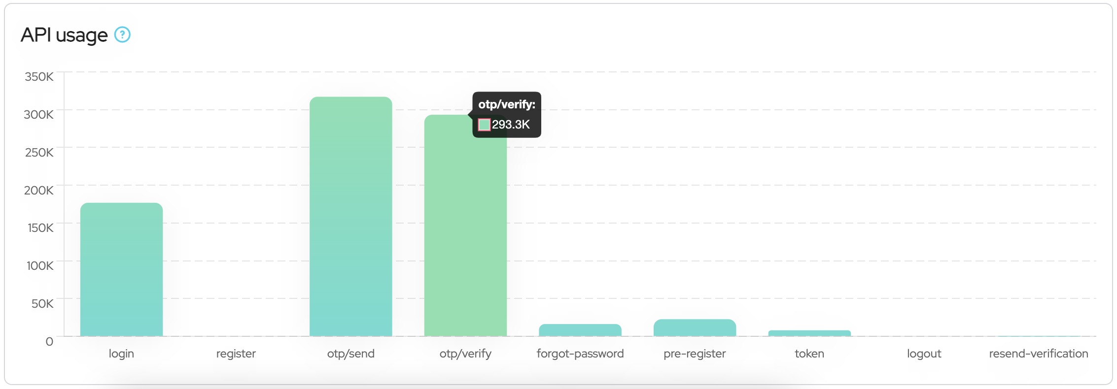
The API usage graph.
Logout
Once you're done using the dashboard, please logout properly. To do so, click on the dropdown menu on the upper right corner of the dashboard, then select Logout.

Logout menu
Feedback form
Please let us know your experience using the Analyze dashboard. Click on the Feedback tab on the right side of the dashboard and rate us.

Feedback tab.

Feedback popup
Once you've selected your rating, additional options like entering your feedback, and selecting elements on the page to comment on, will become available.

Additional feedback options for your rating.
Updated 7 months ago